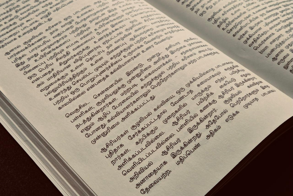
Korkai is a new Tamil typeface released by the Tamil Font Studio (TFS) at the Roja Muthaiah Research Library (RMRL), designed by a team I worked with over the course of a year. The project was supported by the Onmai Foundation, and the font — five weights, plus a variable font that lets you dial in anything in between — is completely free and open source, released under the SIL Open Font License. It’s available for download at tamilfontstudio.net/fonts.
The team behind Korkai includes Muthu Nedumaran, Ranjith Roozo, Prapanja Anandkumar, Abirami Ramasamy, Sundar Ganesan, Vignesh Sundaresan, Narendran K, and Krishnapriya C P.
This post is both a record of how Korkai came to be and an explanation of some of the design decisions behind it, several of which I think are worth understanding even if you never set a line of type in your life.
Why “Korkai”
The name isn’t decorative. Korkai was one of the earliest capitals of the Pandya kingdom, flourishing during the Sangam period roughly two thousand years ago near the mouth of the Thamirabarani river, in what is today Thoothukudi district. It was one of ancient South India’s most important ports — a hub trading pearls, chank shells, ivory, spices, and textiles as far as the Mediterranean and Southeast Asia. Above all, Korkai was famed as a center of pearl fishing in the Gulf of Mannar; Roman writers of the time noted how highly its pearls were valued. Over the centuries, the river silted up the harbour and the coastline receded several kilometres, and trade gradually moved to nearby ports. What remains today is inland, a quiet reminder of how much Tamil maritime and commercial history once passed through this one place.
For a font born out of reviewing old printed books and old letterforms, a name rooted in that kind of deep continuity felt right. And I’ll admit a personal reason too: Korkai’s fame rested on pearls — முத்து — and it’s hard not to notice that pearl is exactly what my own name means.
Why Print Needed a New Typeface
Every year, I visit the Chennai Book Fair, and every year I do the same thing: I flip through newly published Tamil books just to see which typefaces publishers have used. And every year, I come away a little disappointed. Not because the typefaces are bad, but because there is so little variety. It’s as if the choice of typeface is never really a conversation — publishers pick whatever is already on hand rather than choosing something suited to the content. A few books credit the typeface used in their colophon; most don’t. It’s as though the Tamil typeface isn’t considered a real part of the book, or of the publishing process at all.
Over the years, I’ve spoken with Tamil publishers across Tamil Nadu on various occasions. Most know me as “the Tamil font person,” so the subject naturally comes up. More than once, I was asked directly: you design fonts mainly for digital use — why not focus on print?
That question shook me a little. In Malaysia and Singapore, my Murasu Anjal fonts are the default choice for almost all Tamil publishing work. I had always assumed that cost was the barrier keeping Indian publishers away — that a font they’d have to pay for was competing against one that came bundled for free. But this comment made me realise something else was going on: even publishers who were willing to pay for a Tamil font weren’t choosing mine for their books.
So I dug further, and found the real reason. It has nothing to do with design quality, legibility, readability, letter-spacing, or how well a typeface’s weights work together for titles and emphasis. There is really just one question that matters to a print publisher: how many words can I fit into a line, and how many lines into a page, with this font? The cost of printing determines the retail price of the book, which determines whether the book turns a profit at all. Everything else is secondary.
This became one of our starting criteria when we first sat down to plan Korkai’s design — after reviewing dozens of old printed books that had used metal type. It’s a genuine, practical constraint, and one we felt we owed the publishers the respect of taking seriously.
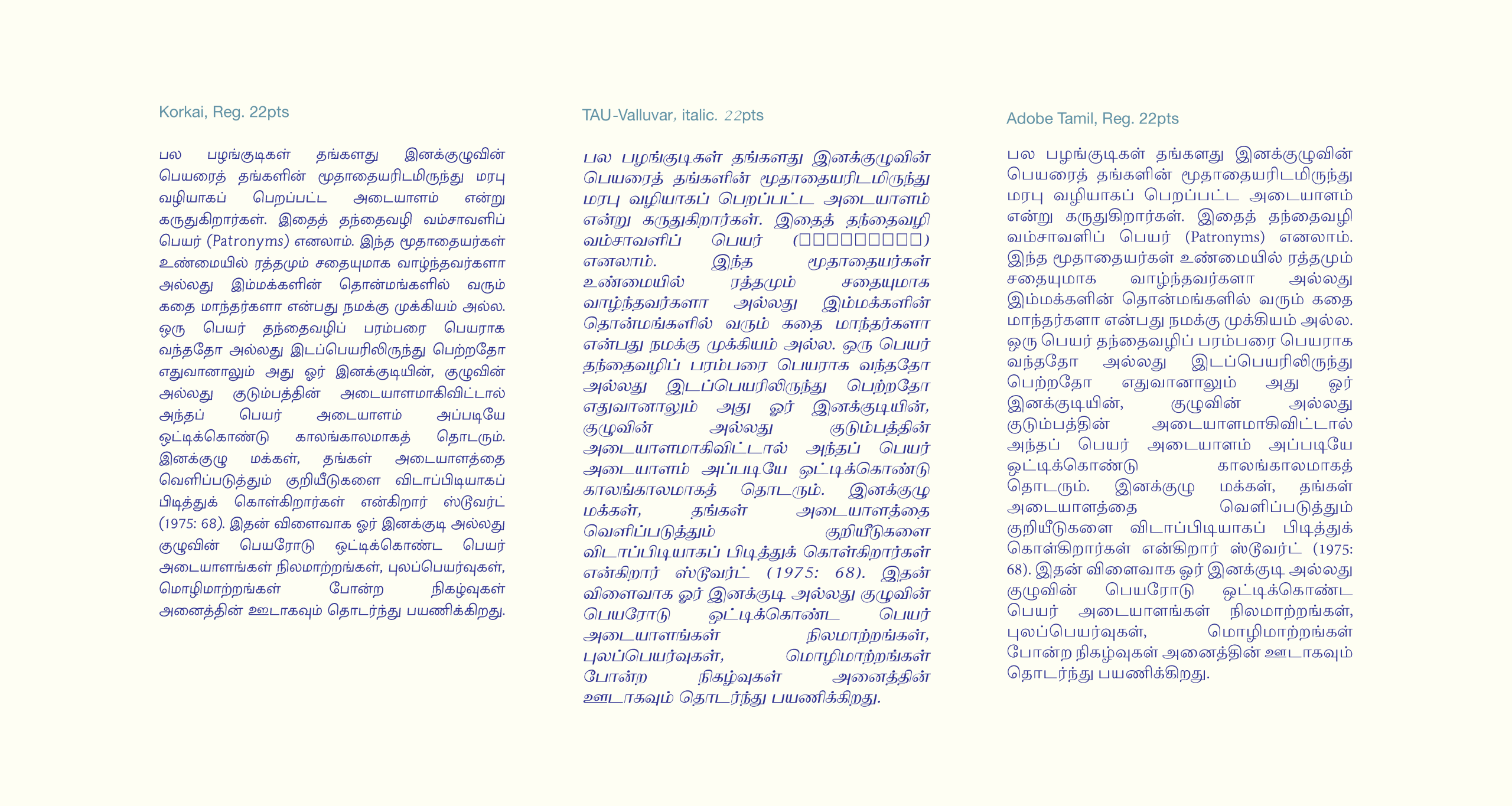
A Typeface That Disappears
We chose letterforms that stay close to tradition — not archaic, not overly modern. Familiarity matters here: if a reader has to think about the shape of the letters, even for a moment, they’ve been pulled out of the story or the argument they’re reading. Type designers have a phrase for this — a good text typeface should “disappear” the moment reading begins. Every additional flourish or feature is a small tax on the reader’s attention, and we wanted to keep that tax as low as possible.
Five Weights, Three Masters
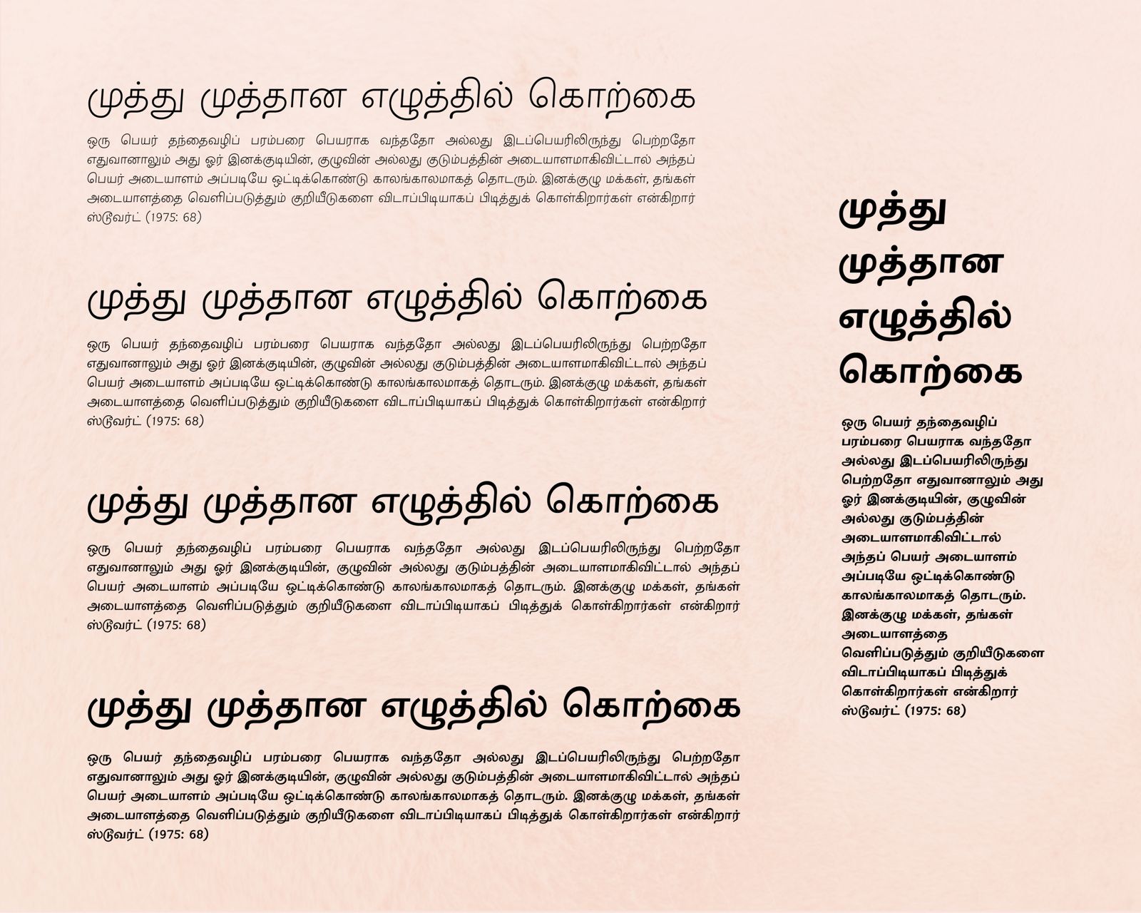
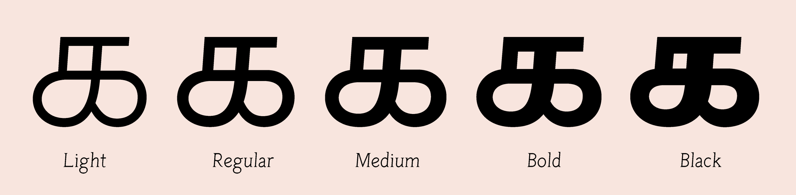
We had only one weight — the regular — to work from in the historical sample we were reviving. But we didn’t want to leave it at that. We designed five weights built from three masters: a light and a black master, both drawn by hand, and a medium weight interpolated between them with additional hand adjustments. Regular and bold are fully interpolated, with no manual intervention. Korkai is also released as a variable font, so a publisher can dial in any weight between the extremes, not just the five fixed instances.
The Launch
Korkai was officially released on 19 December 2025, at a special event at the Roja Muthaiah Research Library — a genuinely rare occasion, since dedicated “Tamil font release” events are hard to come by in Chennai.
Among those attending was Vaishnavi Murthy Yerkadithaya, Creative Type Director at Monotype, who had come from Bangalore as a guest. She called Korkai a showcase of how a revival font project ought to be done. Coming from someone with her background in multi-script type design, that meant a great deal.
What Readers Told Us
Since the release, people using Korkai have sent us encouraging, specific feedback: easily readable, calm — it quietly helps you read, sits somewhere between serif and sans-serif, and fits more text into limited space without feeling compressed. Each of these lines up with something we deliberately aimed for, which is reassuring in itself — it means the design choices we made were actually felt by readers, not just intended by us.
Between Serif and Sans-Serif — On Purpose
The “sits between serif and sans-serif” comment is worth unpacking, because it points to a technique I’ve used across several of my Murasu Anjal fonts.
To start, Tamil type isn’t usually classified as serif or sans-serif — that’s a Latin-script distinction. Tamil fonts with actual serifs do exist, borrowed from Latin design conventions, but they show up only in display faces, never in text faces. What people usually mean by “serif” and “sans-serif” in a Tamil context is really modulated versus unmodulated: modulated meaning a high contrast between thick and thin strokes, unmodulated meaning a more uniform stroke width throughout the letter.
So — is Korkai modulated or unmodulated? The honest answer is: both, depending on the weight. This is a design choice I’ve carried across several of my variable-weight Murasu Anjal fonts. The thinnest weights are drawn with very low contrast — close to a uniform stroke width. The boldest weights are much harder to get right in Indic scripts, because several letters involve strokes crossing over each other in complex ways. If you try to keep a uniform stroke width all the way into a very bold weight, you end up losing the counters — the enclosed white spaces inside the letters — and the letterforms collapse into blobs. So instead, I draw the extreme bold master with a deliberate contrast between thick and thin strokes, precisely to keep those counters open. When you interpolate between the two masters, something interesting happens: the lighter interpolated weights read as nearly unmodulated, while the bolder ones read as visibly modulated. That gradient, sitting inside a single family, is what makes readers describe it as sitting “between serif and sans-serif.”
Designing Numbers to Match
We paid particular attention to the characters that aren’t strictly Tamil but appear constantly in Tamil text anyway, starting with numerals. The numerals used in Tamil text today aren’t the historical Tamil numeral forms — they’re the same digits used everywhere — so their proportions don’t follow Tamil’s shape grammar at all, and they tend to look oversized next to Tamil letters. To fix this, we reduced their height slightly so they’d sit comfortably with the surrounding Tamil text.
Designing Latin Characters to Match
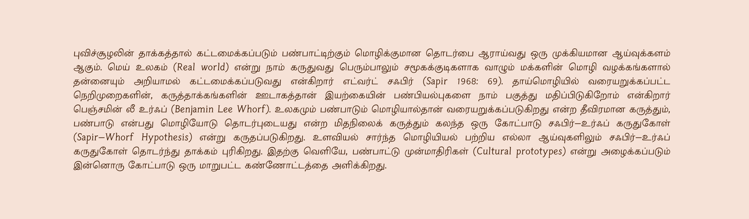
The same mismatch shows up, often worse, with Latin characters. In most printed Tamil books today, the Latin letters used for English visibly clash with the Tamil design around them; some don’t even share the same slant. Tamil text fonts are typically slanted, and that slant angle has nothing to do with the angle used in Latin italics — so dropping any ordinary Latin font into the English portions of a mixed-language document disrupts the visual harmony.
Because of this, we designed our own Latin characters as part of Korkai itself, rather than pairing it with an off-the-shelf Latin font. The same font can now be used for both Tamil and English (or Malay, for readers in Malaysia) in a mixed-language document. The upright Latin forms are slanted to match Tamil’s own angle, and their overall width is condensed slightly so they sit comfortably within Tamil’s counter space.
Designing for Older Publishing Software
Most modern Tamil rendering relies on OpenType’s positioning technology — GPOS — to attach a vowel sign or a pulli to a base letter precisely, at the moment the text is drawn. It works well, and it’s how the vast majority of software handles Tamil today. But a lot of the software actually used in day-to-day Tamil publishing is old, and its support for GPOS is patchy at best. Depend on it entirely, and a pulli can land in the wrong place, or fail to attach at all, on exactly the kind of production system a real publisher is likely to be running.
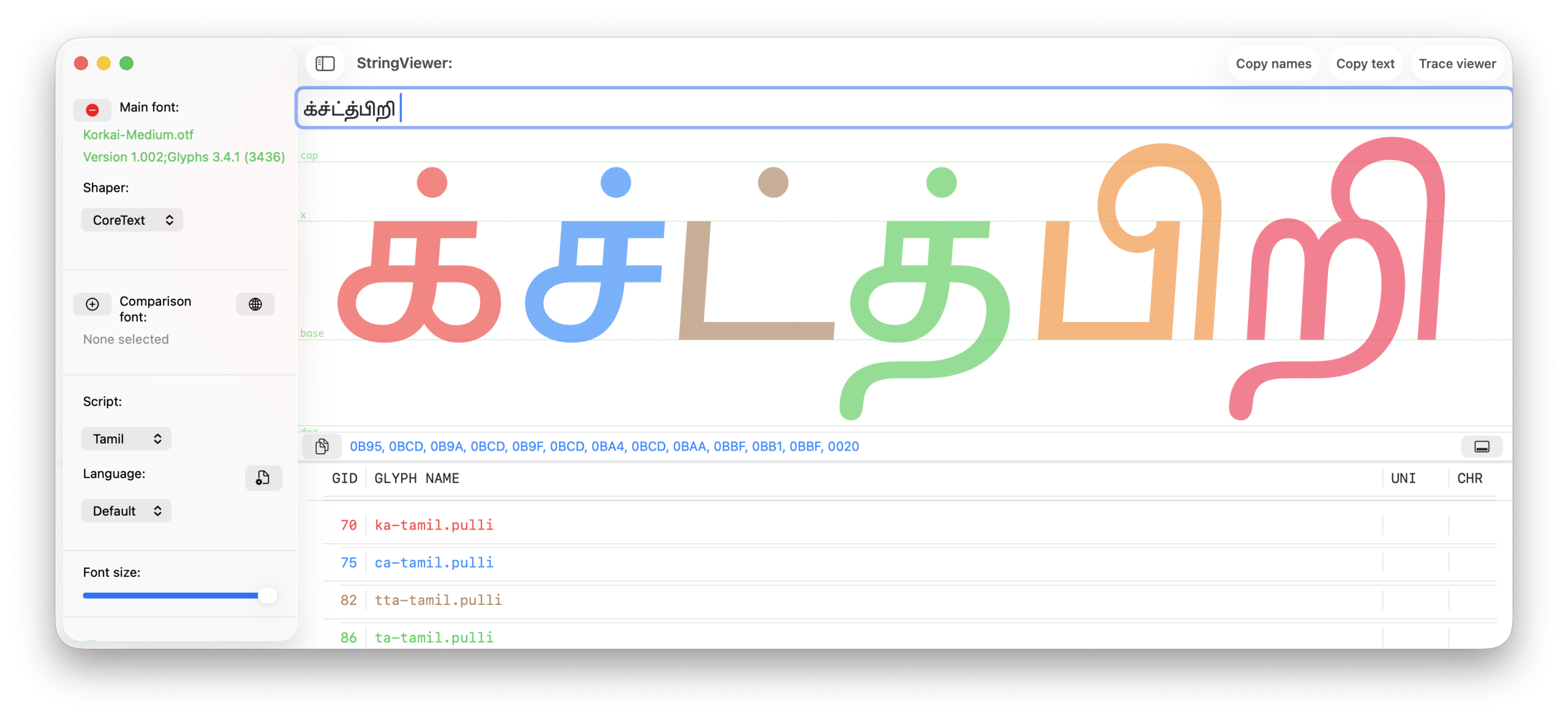
So for every combination involving the short and long i vowel signs together with a pulli, we didn’t leave the result to be calculated on the fly. Korkai includes an actual precomposed glyph for each of these — a single, ready-made shape built in as a ligature, rather than three separate pieces assembled at render time. It’s a less elegant solution than doing it dynamically, and it does make the font file larger. But basic glyph substitution is something virtually every piece of software has supported reliably for decades, even the software a type designer might privately consider obsolete. That reliability was the whole point — the same respect for how publishers actually work that shaped Korkai’s design from the very start.
Making sure every one of these precomposed forms was actually present, and rendering correctly, isn’t something you can check by eye. We used Hibizcus — the font proofing and debugging tool I built — to go through the full character set systematically and confirm nothing was missing.
Resolving an Old Ambiguity in the Au Vowel Sign
The Tamil “au”-length vowel sign uses exactly the same shape as the letter ள (LLA). This is a long-recognised source of confusion — a word like கெளவி can read as either kelavi (an old woman, in spoken Tamil) or kauvi (to grab with the mouth), and the identical glyph shape does nothing to help a reader tell which is meant.
The usual industry recommendation is to shrink the au-sign slightly so it reads as visually distinct from ள. We didn’t like that fix — it breaks the uniformity of the design for the sake of disambiguation. Instead, we used an approach I first proposed on 18 October 2015: use the beakless form of ள for the au-sign, the same way the ai vowel sign already uses the beakless form of ன. I spoke about this at length in this video, from 1:26:49.
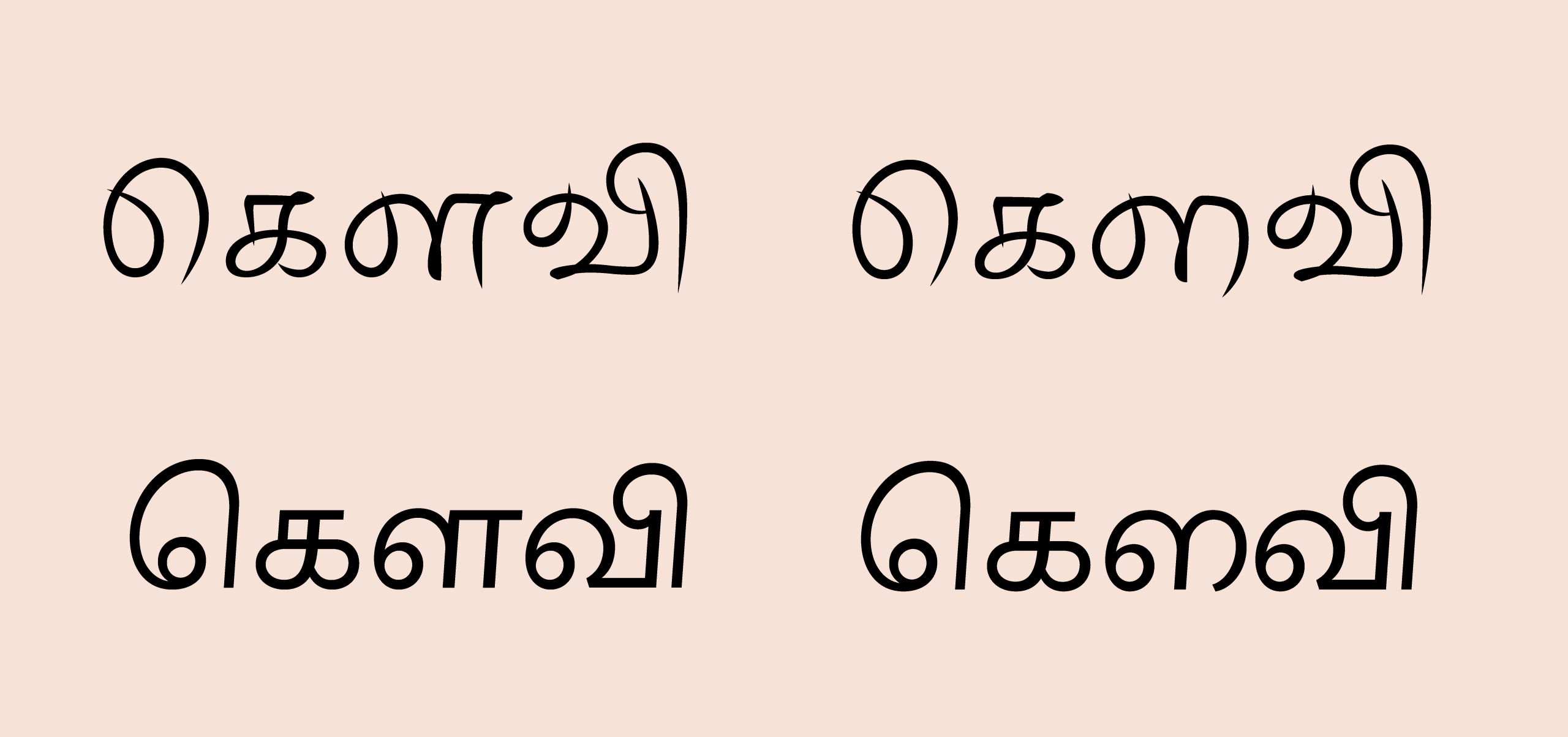
So far, the response from users has been consistent: it looks unusual at first, but makes complete sense once explained — which we consider a win. This isn’t the first time I’ve used this form; several of my Murasu Anjal fonts already do, most recently Anjal Keetru.
Watch the Launch Presentation
Ranjith presented our design process and project timeline in more detail at the launch event — you can watch his segment here, or browse the full set of launch videos.
What’s Next: Italics
Simply slanting a typeface doesn’t make it an italic — and Tamil letterforms are already slanted by convention, so mechanically slanting them further produces nothing meaningful for emphasis. A genuine italic is a distinct design problem, one that needs real research into what “emphasis” should even look like in Tamil type. This is, in fact, the subject of my PhD research, and I’m hoping it will let us arrive at an italic — or some equivalent complementary design approach — for Tamil typefaces by the time it’s done.
Why This Project Matters
Good design needs attention before it needs money. Funding helps, but only once people first recognise and value the design work itself. Korkai — and the wider work TFS is doing at RMRL — has found that recognition. We were fortunate to have the Onmai Foundation’s support: an organisation that understood, early, why quality and considered craftsmanship in Tamil typography matter. We hope TFS can take on more projects like this, and, over time, help build wider appreciation for the craft of Tamil type design.
What You Can Do
If you use Korkai, tell others about it. Mention it in the colophon of your books, periodicals, or other materials. Share this story. And here’s hoping that the next Chennai Book Fair shows a little more variety on its shelves.