In February this year my feeds filled up with photographs of a wall in Egypt.
Two researchers — Charlotte Schmid of the École française d’Extrême-Orient and Ingo Strauch of the University of Lausanne — had spent 2024 and 2025 documenting around thirty inscriptions scratched into six rock-cut tombs in the Theban necropolis, in and around the Valley of the Kings. Alongside Prakrit, Sanskrit and Gandhari-Kharosthi, a large share of them were in Tamili. One name, Cikai Koṟṟaṉ, appears eight times across five different tombs. Next to one of them, someone had written — two thousand years ago — that he came and saw.
Tamil merchants, in the tombs of the pharaohs, doing what visitors have always done: putting their names on the wall.
The story went everywhere in the Tamil-speaking world. Newspapers, ministers, and — more tellingly — the family WhatsApp groups.
What stayed with me was not the coverage. It was what came after it: the number of people who wanted to know how to write their own name that way.
That impulse has been building for a while, and it turns up in places with nothing to do with archaeology.
This year there were two classes that I know of, and between them they say more about where this has got to than any headline could. In March, the Thirumullai Tamil Sangam ran five consecutive evenings on Tamili inscriptions and letter practice: an hour a night, ₹500, e-certificate at the end. In May, Heritage Treasure and Maṇ Marapu ran a full summer course: Friday and Saturday evenings through the month, ₹1,000, covering Tamili, Vaṭṭeḻuttu, Chola-period letterforms, numismatics, and how to stand in front of a temple wall and actually read it. The teachers were Dr. C. Vasanthi and Dr. R. Poonkundran, retired Director and retired Assistant Director of the Tamil Nadu State Department of Archaeology.
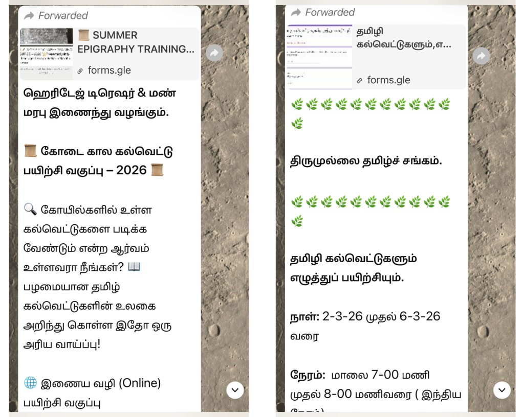
Read that again. A retired Director of the state archaeology department, teaching Tamili to whoever signed up, for around twelve US dollars, over video, on weekday evenings.
The part I nearly missed is this. Neither course has a website, and there is no page that can be linked to. Both were announced by WhatsApp forward, registered through a Google Form, paid for by GPay, and taught inside a WhatsApp group where the certificates were handed out at the end. When I went looking for evidence of this appetite in the usual places I found very little. This is not because the evidence is absent, but because it does not generally live where such things are searched for; it lives in forwards.
This is worth dwelling on, because it costs us. Every time I take a proposal like this to a vendor or a platform, I am asked for the links: the community forum, the user group, the website with the numbers on it. They do not exist. The absence gets read as absence of demand, when what it actually reflects is a community that organises itself in a place nobody outside it can index.
At the informal end, the same thing in a different register: YouTube channels working through the letters one at a time for an audience that is plainly not academic, and my friend Chithu, who makes posters and signboards in Tamili, not as illustrations of an ancient script but as things people want on their walls and above their shops. (More of her work.)
The teachers are scholars; the students, of whom there are a great many, are not. Tamili, or Tamil Brahmi, the oldest form of written Tamil we have, the script of the cave inscriptions and the potsherds, has belonged to the academy for as long as anyone has studied it. It is now being asked for by people who simply want to write in it.
I have been one of those students. Some years ago I signed up for an online course much like these, because I wanted to be able to read the inscriptions myself.
The interest had my attention well before that, though. Watching Tamili turn from a topic for the specialists into something people talked about is what set me going in the first place, and the first thing I did about it was draw a font. Everything since has followed from that.
So this is not an interest I am watching from outside. It deserves better tools than it has. Over the past few years I have responded in four ways, and this post is about the fourth, an app called Urai, with the first three as the ground it stands on.
What Tamili is, briefly
For people who are not familiar with it: Tamili is the script Tamil was first written in, found on cave shelters, on hero stones, and scratched onto pottery across Tamil Nadu — and, as February reminded everyone, a good deal further than that.
Where it sits in the Brahmi family is a live argument and I am going to stay out of it. The conventional account makes it an adaptation of Brahmi for Tamil; excavations at Keeladi and Sivakalai have produced dates that would put Tamili earlier than the Ashokan cave inscriptions, which would change the picture considerably. The findings are not fully published and the question has become a political one. I have no standing to settle it and this post does not need it settled. What follows is about writing the script, not about where it came from.
It is also a live part of the digital world, which is the part most people don’t expect. Unicode encodes Brahmi in the range U+11000–U+1107F, and in 2018 it added five characters specifically for Old Tamil — including the pulli, 𑁰, the dot that strips a consonant of its inherent vowel.
That addition did more than fill a gap, and this is worth being precise about, because it is widely misunderstood. Brahmi already had a virama, which also strips the inherent vowel. But a virama does a second job in the scripts that use one: consonant + virama + consonant is how you form a conjunct, two letters fused into a third.
Tamil has no conjuncts. It’s not even “rarely used”. The writing system has no such construction. The pulli marks a bare consonant and stops there. (The க்ஷ that gets offered as an example of a Tamil conjunct is not Tamil at all. It is Grantha, a separate script with its own encoding.)
Encoding Tamili with the general virama would therefore have handed every pulli a standing invitation to fuse into something Tamil does not have. U+11070 exists, and Unicode names it the Old Tamil virama, precisely so that it cannot. It is a pure killer: it removes the vowel and joins nothing to anything, which is what a pulli has always been.
A virama is not a pulli. That distinction is most of the reason the 2018 additions were needed at all.
I will talk about the pulli again in a later section.
Response 1: A font
The first thing a script needs is a shape.
That course taught me the letters the way a student learns them: one at a time, in the order the hand draws them. It also showed me something I had not expected: the same letter looks different from one inscription to the next, and nobody tidies that away for you.
It left me with a problem, too. Having learned to read the things, I had no way to set them.
Designing a typeface for a script that nobody alive writes by hand means the research is the work. The letters are not stable. A form cut into a cave shelter in Tamil Nadu is not the form on a pillar in the north, and neither is the form two centuries later in either place. An average of these forms cannot be drawn and called a typeface. The designer has to decide what is being represented, and then hold that decision steady across every letter, because a font has to agree with itself.
For that I leaned on Indoskript more than on anything else. A search for a single letter would lay out its forms across different parts of India, exactly the variation a palaeographer carries in their head. These variations are assembled in one place and, crucially, queryable. The search could be bounded by date, and a box dragged across a map to restrict it to a region.
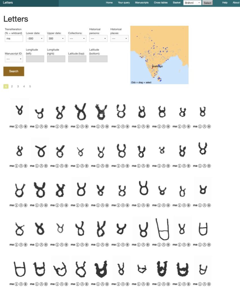
Here is the kind of thing it showed me. In July 2022 I asked it for ma between 300 BCE and 300 CE. Page after page came back, and the shape drifts as your eye travels down it: in some hands a loose figure-of-eight, two lobes with a fork opening at the top; in others the same letter flattened into a U with a crossbar. Same letter, same centuries, two different ideas of what it looks like, broadly a northern tendency and a southern one.
In a modern typeface, we don’t have to choose. Both forms can exist in the font. A locale feature picks between them, in the way श takes one shape for Hindi and a different one for Marathi. Both forms exist in the same font, decided by the language the text is tagged with. Brahmi has nothing of the kind. There is no language tag for northern or southern Brahmi, and nobody setting Tamili on a phone would reach for one if there were.
So the choice gets made once, at design time, and it has to hold for everybody. I went for the middle: something between an open 8 and a U with a crossbar. A form a reader arriving from either tradition will recognise, rather than one that is exactly right for half of them and strange to the rest.
That is a decision an inscription never had to make. The carver only had to be legible to the people who would walk past that particular wall. A font has to be legible to all of them at once.
The rest of the alphabet argued back much less, because most of Brahmi is straight lines, and a straight line has fewer ways to disagree with itself than a curve does. The one letter with real curvature, ழ, is Tamil’s own; there is no competing northern form of it, because nobody else had the sound.
The work was elsewhere. Two things took the time: the conjunct forms, which Tamil does not use but the font has to carry because the Brahmi block serves more languages than Tamil, and the numerals, which had to be gathered from the inscriptions. For both I stayed with what the Unicode proposals set down, those of Andrew Glass and colleagues, rather than deciding again from the sources. Where a standard has already made a defensible choice, a font’s job is to render it, not to relitigate it.
So I designed a Brahmi typeface covering the Tamil-specific extensions. It ships with macOS and iOS.
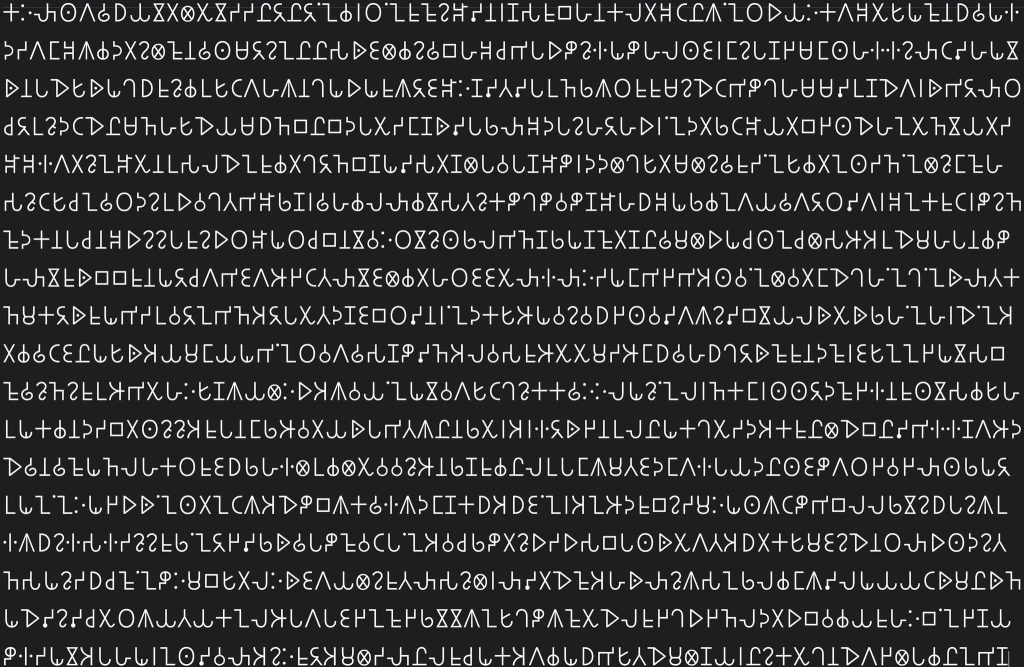
Shipping in the operating system matters more than it sounds. It means Tamili is not a download, a plugin or a workaround: it is a script your device already knows how to draw, the same way it knows how to draw Tamil. Windows covers Brahmi too, in Segoe UI Historic, which has shipped since 2015 and has since been updated to include the Old Tamil characters.
Indoskript, meanwhile, is gone. The site is no longer reachable and the collection went with it. There is something worth noting in that. This is a post about making a two-thousand-year-old script writable on a phone. The best digital resource available for the work did not last twenty years. The stone, meanwhile, is still there.
Response 2: A way to type it
A font gives letters that can be read. It gives nothing that can be typed.
There is no Tamili keyboard, and there is no reason there should be one. Nobody has muscle memory for a layout of a script they have never typed in. So Murasu Anjal takes the other route: Tamili is a target, not a layout. Typing proceeds as it always has, in Anjal, Tamil99, or one of the legacy typewriter layouts. The output is Tamili.
The point is that the skill you already have transfers whole. A typist who has used Tamil99 for twenty years does not have to learn anything to write in a two-thousand-year-old script. They just switch the output.
I am now looking at bringing the same mechanism into Sellinam, my keyboard for iOS and Android. If that is completed, Tamili can be typed straight into a text message — WhatsApp, SMS, anywhere the keyboard reaches — rather than being produced in one app and copied into another.
Response 3: Practice, in a game
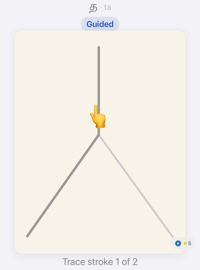
Reading a script and writing it are different skills, and the second is what makes the first stick. So Tamili went into Solvalam as practice. Each letter is drawn with a finger on the screen, and the app compares the trace against a built-in font that carries stroke directions. I made a font for this purpose and for nothing else.
There is a problem hidden in that sentence.
Tamili survives on cave walls and hero stones. It was cut, not written. It was very likely written on palm leaf first, but no material evidence of that survives, so there is no authority to consult on stroke order. Nobody can tell you which end of a letter the hand started from.
Therefore, I decided on this myself. The order and direction Solvalam teaches are my reconstruction of how the strokes would go if it were written with a pen. I reasoned the directions from the shapes themselves and from the way Tamil is written now. It is not recovered from any source. The game enforces them strictly, and it does that for teaching reasons alone: a consistent order is what lets a beginner build muscle memory, and it is the only way the app can tell a good trace from a bad one. It is not a claim about how anyone wrote in the second century BCE, and I would not want it read as one.
Two display faces came out of that work, for the posters and cards you can make inside the app. Practice that produces something you want to keep is a better reason to practise than the practice itself.
Response 4: Urai
The three above cover the shape, the input, and the practice. What was left is the everyday case: I have some Tamil, and I want to see it in Tamili right now.
Where it came from
Urai started with a request from the Roja Muthiah Research Library. They were preparing material for an exhibition and wanted paragraphs of Tamil shown in Tamili, and asked whether that was possible without retyping the whole thing in Murasu Anjal. It was. The conversion engine was already running inside Anjal. Pulling it out into a small tool took a few minutes.
That is why the app started life as a converter rather than an editor, and why it was called Tamil-Tamili for as long as that was all it did.
What it does now
Urai is a small editor. Type or paste text and pick a tab — Tamil, Tamili, or Latin. The text is then in that script. There is no convert button and no separate convert step. Switching tabs is itself the conversion, and it works in every direction.
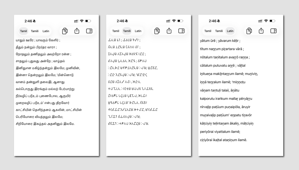
The Latin tab is a transliteration in the ISO 15919 tradition — tamiḻ, vaṇakkam. This is the romanisation generally used in scholarly work. The diacritics are what make it reversible rather than approximate. This is the third script. It is the one that makes the app useful to people who cannot read either of the other two.
Everything round-trips. கண்ணன் மண் மேல் நின்றான் becomes kaṇṇaṉ maṇ mēl niṉṟāṉ, and then the original again. It comes back exactly, not approximately.
The name
Tamil-Tamili was an accurate name for a converter. It is a poor one for what the app is becoming. உரை means text. It also means commentary, the gloss tradition that ran alongside Tamil literature for two thousand years. That suits an app which relates to inscriptions.
And it passes its own test. உரை → 𑀉𑀭𑁃 → urai: three scripts, one word, unchanged on the way back.
The tab is authoritative
The first version had three buttons — To Tamil, To Tamili, Transliterate. Each one guessed. It counted the characters in the buffer, decided which script the text was probably in, and converted from that.
For a page of clean Tamil it worked. For mixed content, for short input, for one English word sitting in a Tamil sentence, it either converted from the wrong script or silently did nothing at all. No error, no message; the click just didn’t take.
Tabs removed the guess. Choosing a tab is itself a statement of what is being edited. There is nothing left for the app to work out.
The old detection is still there, but it no longer decides anything. It sits in the inspector and reports what script it thinks the text is in, and it is most useful on the rare occasion it disagrees with you.
When the user has already said what they mean, there is nothing left to guess.
Counting the way a reader counts
The inspector shows character, word, line and paragraph counts, and one of those numbers is not the number most software would give you.
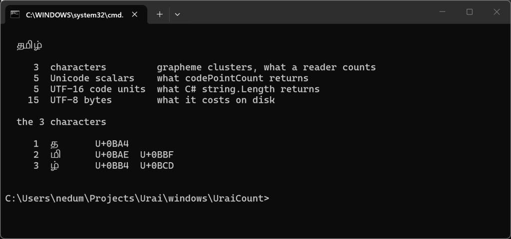
Ask almost any app how long the word ‘தமிழ்’ is and it will say five. That is the number of Unicode characters. The vowel sign I and the pulli are separate characters in Unicode. For a Tamil reader, however, it has three letters — த, மி, ழ். That’s it.
Urai says three. The count in a Tamil app should match the count in a Tamil reader’s head.
The font that was there, and wasn’t
I kept a notes file through the build. One entry from it is worth repeating, because it is a case where I checked something carefully and still got the wrong answer.
I assumed the hard problem would be rendering. Brahmi lives in the supplementary planes and most fonts do not go there. A screen full of empty boxes on a reader’s phone is not a bug you recover from. That user is not going to come back.
So I inspected the font instead of assuming. Tamil Sangam MN on my Mac covers every Brahmi character the app emits, in every face. It ships on iOS as well. I wrote “no font needs bundling” into the README with some satisfaction.
Then I ran it in the Simulator and got a screen full of empty boxes.
This is what I had missed. It is the part worth carrying away: a platform having a Brahmi font does not mean it has the Brahmi characters that are needed. Fonts of the same name are built differently for different platforms, and coverage moves between OS versions. What iOS fell back on covered the Brahmi block almost completely, and was missing exactly the five Old Tamil characters added in 2018, the pulli first among them.
Almost complete is the dangerous kind of broken. The pulli is one of the commonest marks in written Tamil. A font without it does not fail on rare words. It fails on most of them, after appearing to work for a few seconds.
Urai therefore carries its own font, and decides which one to use by probing the device for U+11070, not by checking the OS version, and not by trusting a font’s name. Both are proxies for a capability you can simply measure, and both would have been wrong at least once.
How right that turns out to be is easiest to see by asking the same question of three platforms. macOS has the character. iOS, at the time I was building this, did not. Later versions of iOS do, and they carry my font. Windows has it as well, and draws it beside the consonant rather than above it.
Three answers to one question, and one of them changed while I was still writing the app. That is the whole argument for asking the device rather than reasoning about it.
That difference in placement is worth a mention. It is not a mistake on anyone’s part. Where the pulli sits on a letter is not explained by anything I have been able to find. Tolkāppiyam says to add a pulli; it does not say where to put it. I asked people who would know, and no source material turned up. So it is a design decision, and two of us made different ones. I put it in the middle, optically centred on the letter. If the letter has a horizontal stroke on top, as in ṇa, the pulli sits above it. If it has an opening inside, as in ṭa, the pulli sits inside. It saves horizontal space, it causes fewer kerning problems, and it is closest to what a modern Tamil reader expects. Windows put it on the right. Neither of us is wrong, because on this point there is not yet anything to be wrong about.
A note on Swift, and on counting Tamil
Urai is written in the Swift programming language. The model layer, which is the converter and the scratchpad, now runs on Android and Windows as well. This is the first time I have compiled Swift for anything outside Apple’s platforms. It is worth saying why I went to the trouble rather than writing the converter twice more.
It is not code reuse. There are only about 420 lines of shared logic; that is a day’s work in any language.
It is that Swift is unusually good at the thing this app is about. Ask Swift how many characters are in தமிழ் and it says 3. A Swift Character is a grapheme cluster — what a reader would call a letter — and not a Unicode scalar. Almost every other language reports 5. Kotlin’s String.length says 5 and needs a BreakIterator to say otherwise. C#’s string.Length says 5. The same is true, in different words, in Java, Python, C++, JavaScript and Go.
For an app whose entire subject is Tamil text, that default is not a detail. Every cursor move, every selection, every count, every “delete one letter” is a place where the language either agrees with the reader or has to be argued with. Swift agrees by default, on every platform I take it to. That is what I am carrying across, not the 420 lines.
Try it with your own name
The most convincing thing I can suggest is not a feature list. Open the app and type your own name. Then your village’s name. Then the name of someone a few generations back in your family, the kind of name that is written on a wall somewhere.
You will be looking at the way it would have been written before there were books to write it in. That is the whole reason I built this.
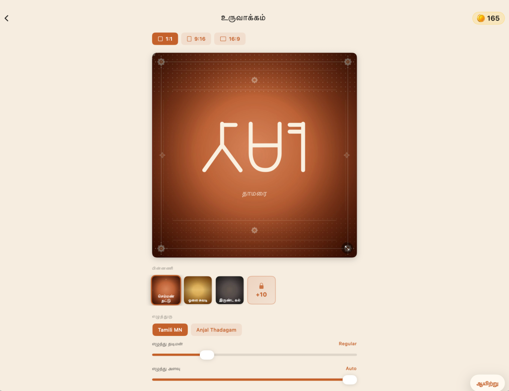
Solvalam‘s Poster Studio is there for keeping what you made, rather than only looking at it. It sets a name or a favourite line in Tamili, as a card or a poster. Short pieces belong there. Anything longer is Urai’s job.
Where it is, and where it goes
Urai works offline. There is no account, no advertising and no network permission at all. It cannot send your text anywhere, even if it wanted to.
It is on the App Store for macOS and iOS, and the Android and Windows builds, the same Swift model underneath all four, have been submitted to their stores.
Some things it does not do yet. Āytham, ஃ, is not yet mapped and passes through unchanged. There is no image or PDF export. This is the request I expect to get first. The Latin tab is strict transliteration rather than phonetic free-typing. This cuts both ways. The diacritics are load-bearing: மரம், a tree, and மறம், valour, are both maram if you write Latin the way people normally do. Only maram and maṟam keep them apart. They have to be explicit. Given the right diacritic the app substitutes the right letter, but it will not guess.
Further out, the plan is a proper Tamil markdown editor: writing in Tamil with the typography Tamil deserves, on all four platforms. Urai is the first piece of it, and a small enough piece to ship while the rest is being thought through.
For now it does one thing. You write Tamil, and you see it the way it was first written down.
The test text
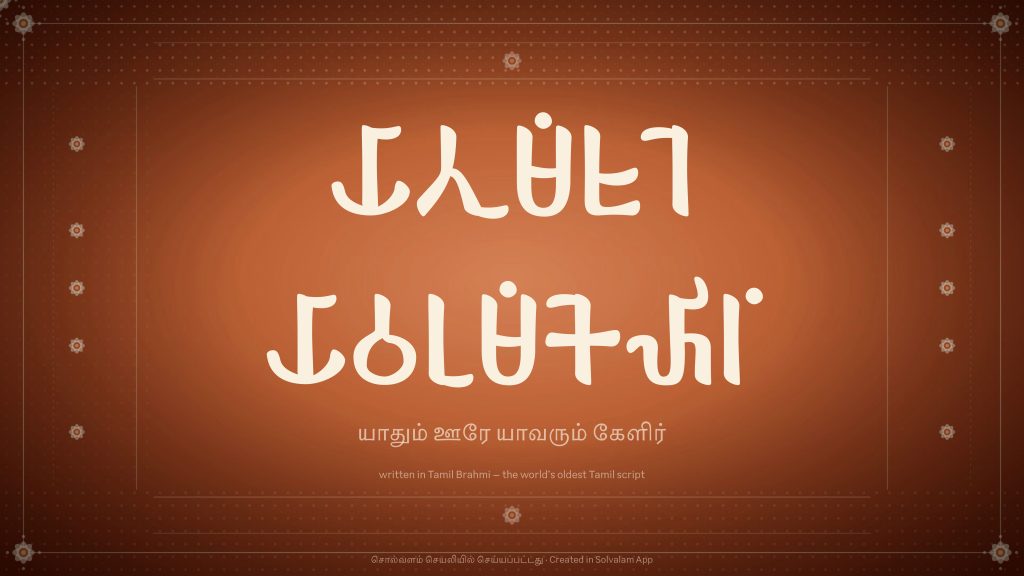
The passage in the screenshots above is not a placeholder. It is Kaniyan Pūngunranār, Puṟanāṉūṟu 192. It has been the text I test with from the first build.
I did not choose it for the sentiment. I chose it because it is Sangam-era, and so is the script. Set that poem in Tamili and you are not looking at a modern sentence in old clothes; you are looking at roughly what the thing was when it was new. Nothing else I could have typed does that.
The sentiment is there anyway, and it is the first line:
யாதும் ஊரே யாவரும் கேளிர்
𑀬𑀸𑀢𑀼𑀫𑁰 𑀊𑀭𑁂 𑀬𑀸𑀯𑀭𑀼𑀫𑁰 𑀓𑁂𑀴𑀺𑀭𑁰
yātum ūrē yāvarum kēḷir
Every town is home. Everyone is kin.
Two thousand years ago a man who came from that world walked into a tomb in the Valley of the Kings and wrote his name on the wall. We have his name. We have the script he wrote it in. What we did not have, until fairly recently, was any ordinary way to write it ourselves. We do now.
One detail about the poster below. It is deliberate, and it will look like a mistake to some readers. There are no spaces in it. The inscriptions had none. Neither did Tamil written on palm leaf, for most of its life. Running the words together was normal. Word division is a comparatively recent convenience that arrived with print. Urai returns the spaces you typed, because what you are doing is writing modern Tamil in an old script. It is not an imitation of carving. Setting a line properly is a different job, and it means leaving the spaces out.
Sources
- The Egypt inscriptions. Documented by Charlotte Schmid (École française d’Extrême-Orient) and Ingo Strauch (University of Lausanne) over 2024–25, and presented at the International Conference on Tamil Epigraphy in Chennai. Reported February 2026 — Tamil Guardian, The Federal.
- Iravatham Mahadevan, Early Tamil Epigraphy: Tamil-Brāhmī Inscriptions. The corpus, and the reference for anything on Tamil-Brahmi palaeography and orthography.
- Indoskript. The palaeographic database of Brahmi- and Kharosthi-derived scripts that most of the font research ran through. No longer reachable; the last archived copy is in the Wayback Machine, though the search itself does not survive archiving.
- The Brahmi block in Unicode, U+11000–U+1107F, and the five Old Tamil characters added in Unicode 11.0 (2018), U+11070–U+11074.
- ISO 15919, the transliteration standard the Latin tab follows.
- Segoe UI Historic — the Windows font that carries Brahmi.
- Richard Ishida’s Tamil orthography notes for the W3C, if you want the modern script’s mechanics set out properly.
- Stefan Baums, Andrew Glass, Proposal for the Encoding of Brāhmī in Plane 1 of ISO/IEC 10646
- Urai — urai.inaiyam.org. Solvalam — solvalam.com. Murasu Anjal — anjal.net. Sellinam — sellinam.com.