I mostly design and engineer typefaces for South Asian and Southeast Asian languages. As type designers, we learn to see, understand, appreciate, and celebrate scripts used to write languages beyond our own.
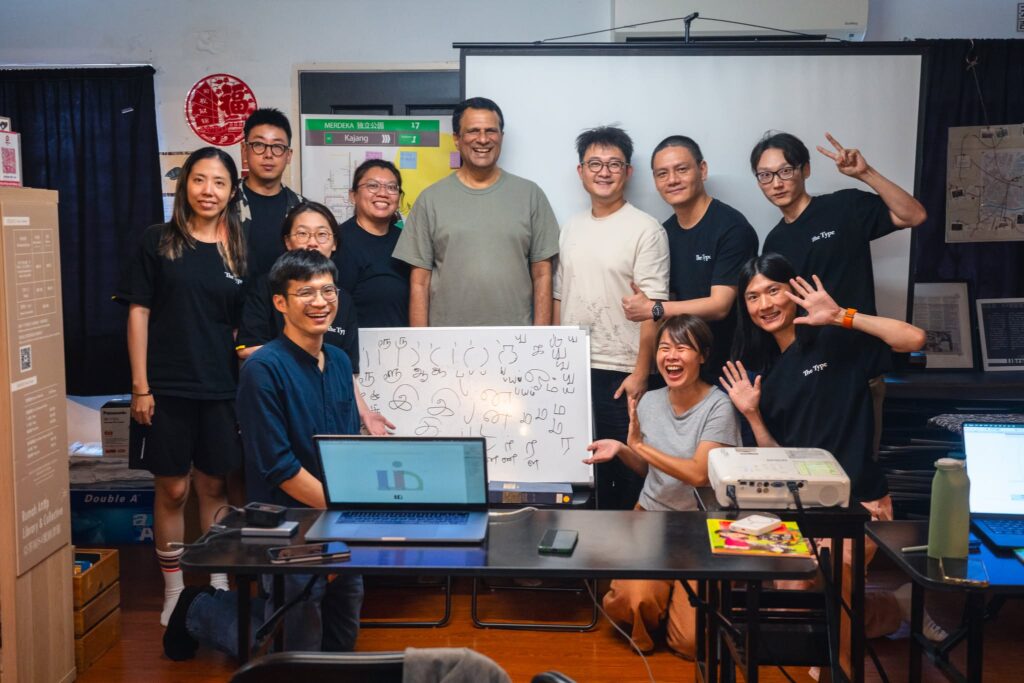
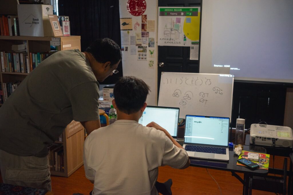
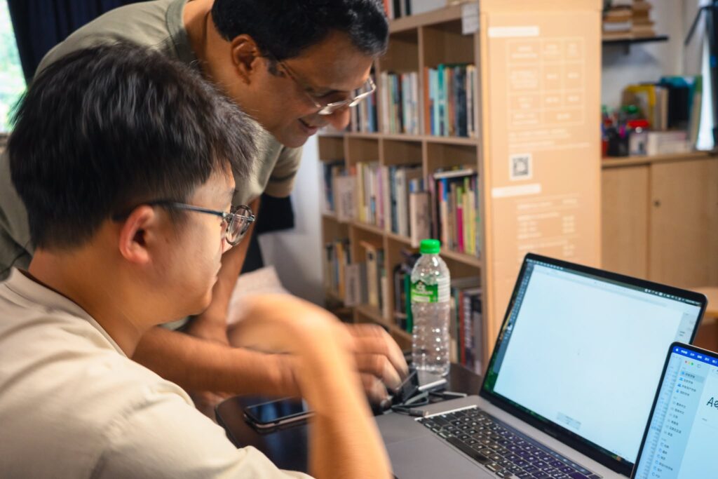
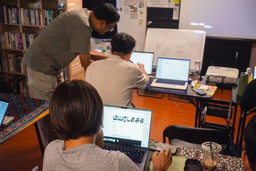
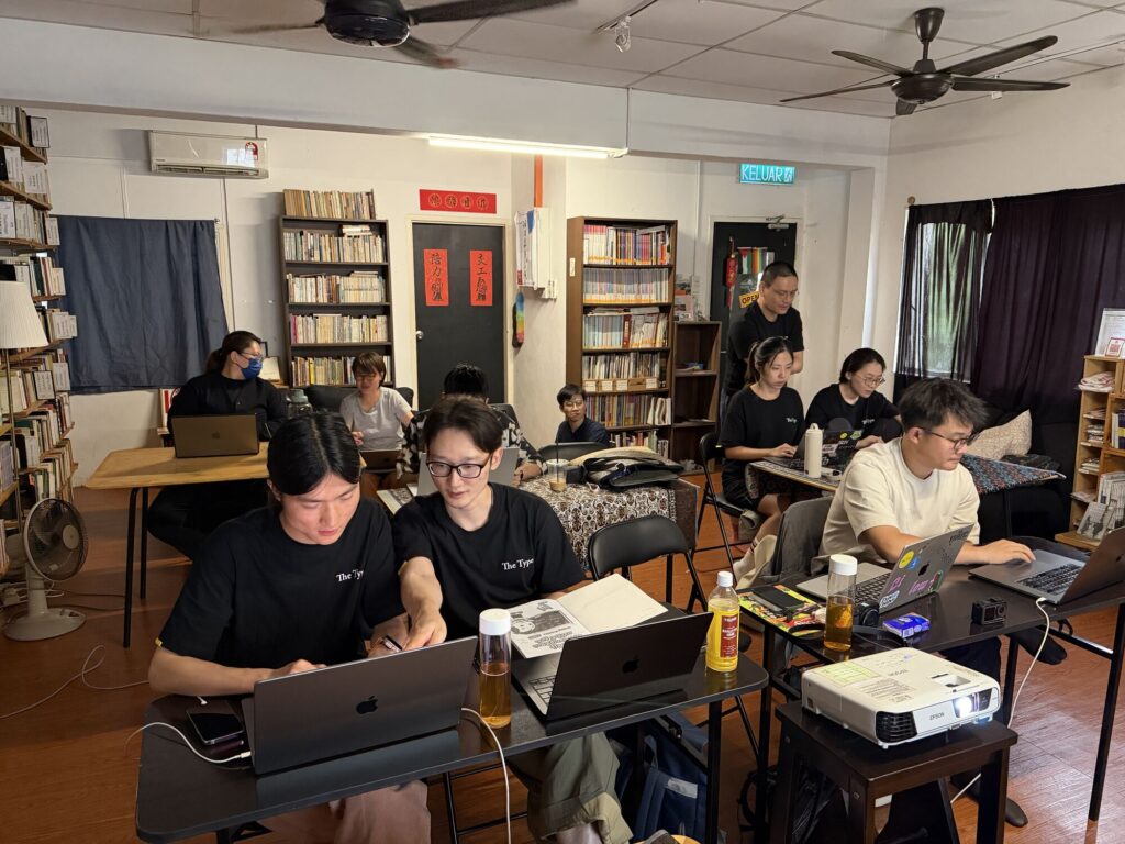
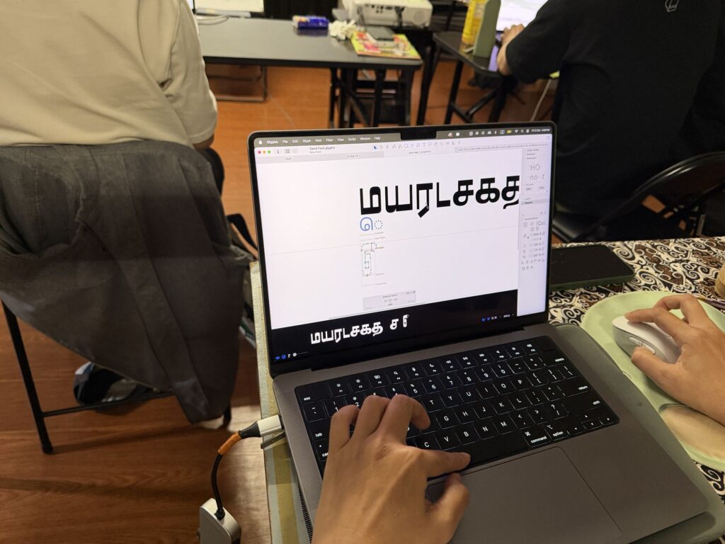
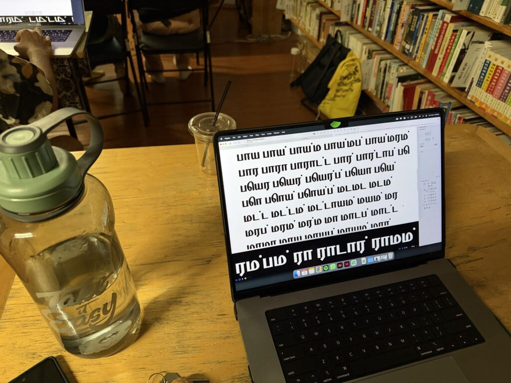
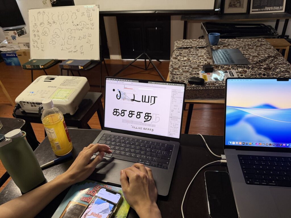
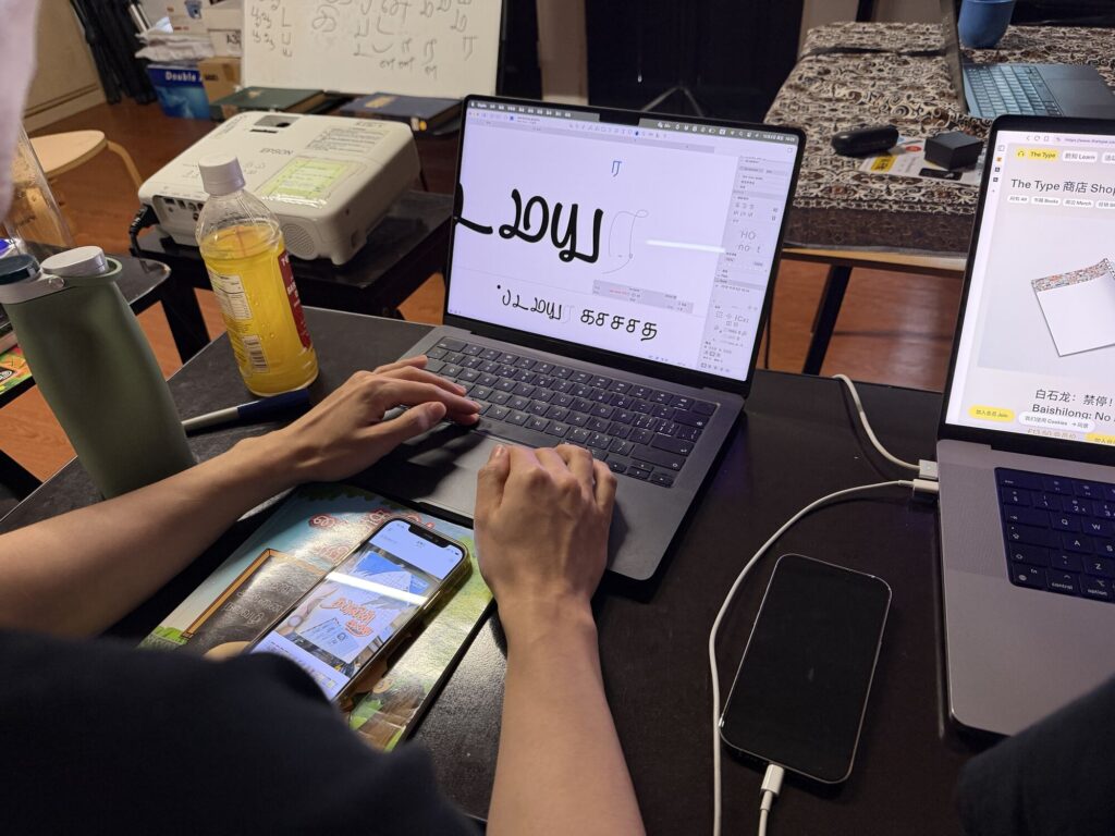
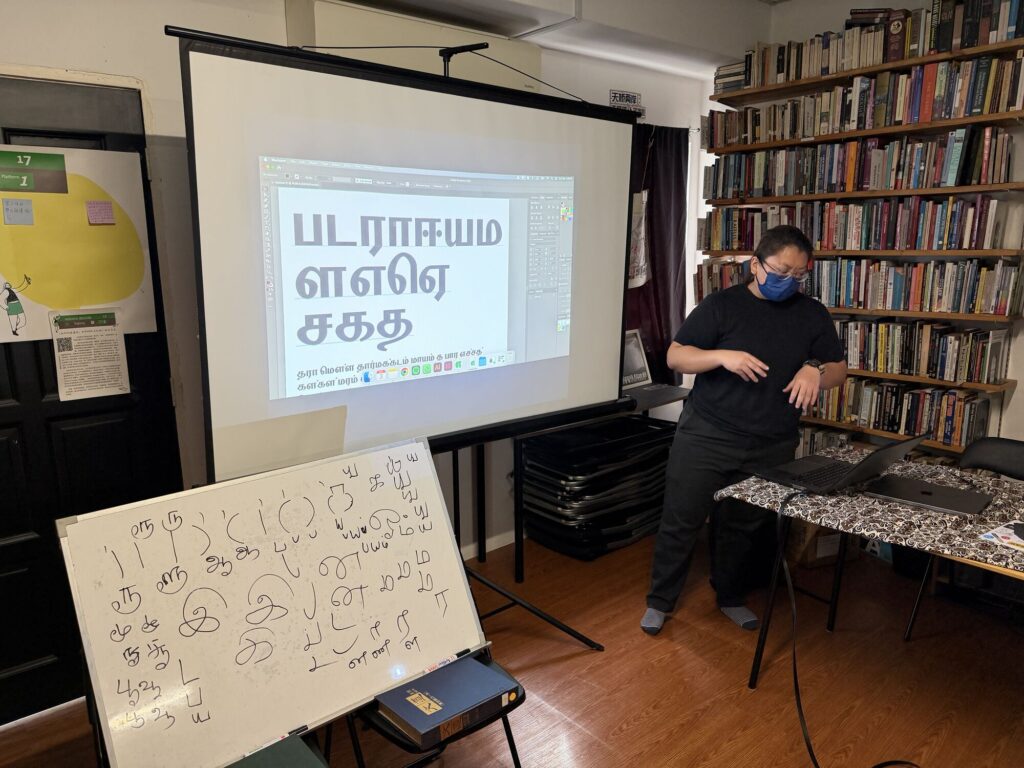
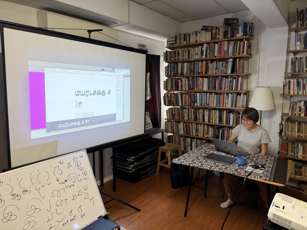
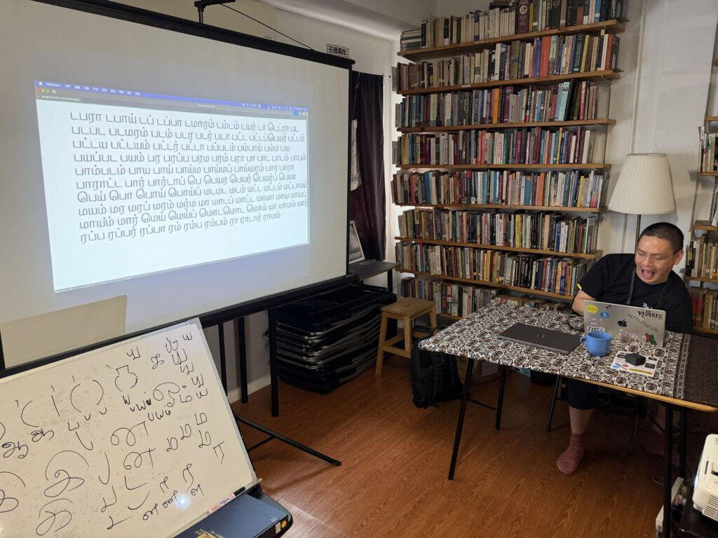
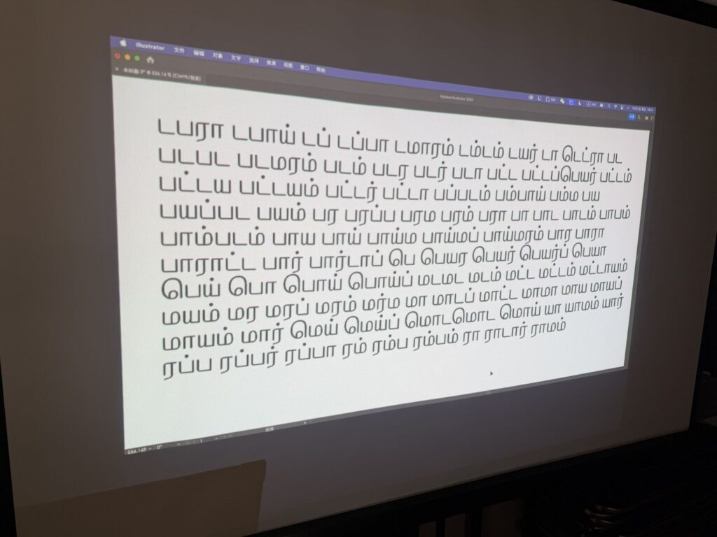
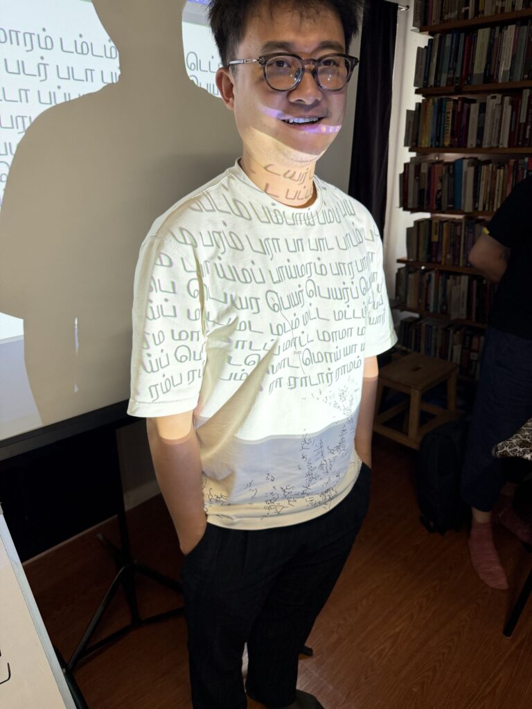
Yesterday, I had the opportunity to run a Tamil type design workshop for a small group of Chinese type designers from Shanghai who were on a short visit to Malaysia. It was such a delight discussing the nuances of Tamil letterforms and exploring various treatments of the strokes. People unfamiliar with a script always see new possibilities in the strokes—details and variations we overlook when we know it too well. The same is true when I work on scripts unfamiliar to me—I ask questions that native speakers often overlook simply because they know it so well.
Variable Fonts and Stroke Contrast
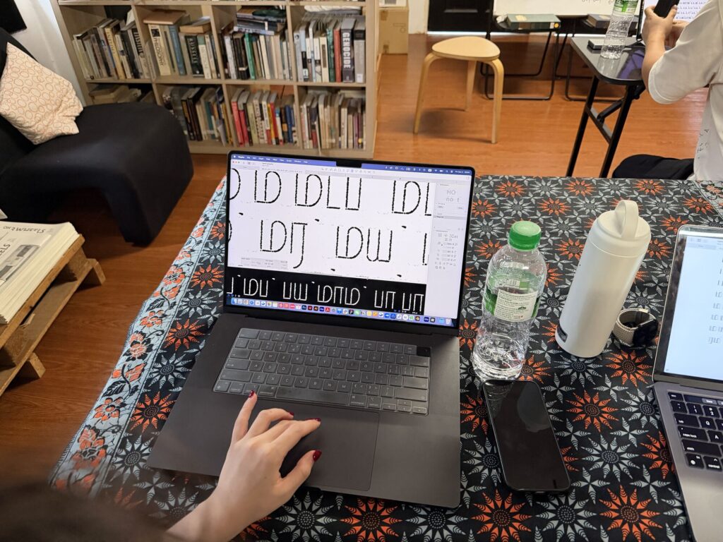
One of the key topics we explored was variable fonts and how to maintain stroke contrast between light and heavy weights. Tamil, like Chinese, has high stroke density in its letters—there are more lines in a Tamil letter compared to Latin. Chinese has even more. This is why weight is distributed to areas that significantly represent the letter, ensuring readability even at bolder weights.
I shared some of my own designs during the workshop. One was a revival of an old Tamil wood type that was used for newspaper headings in the 1960s and 70s. The ascenders and descenders were much smaller than the body, so the text would stand out when read from afar without losing its meaning. The letters remain recognizable when seen in context among others that form the word.
Chinese typography has a similar approach—interesting weight distribution for extremely bold letters where some strokes are made very light so the entire character can still be recognized from a distance.
Loops, Knots, and Legibility
We also talked about the loops in Tamil, which can become problematic when designing heavy weight typefaces. I shared the design of my Aambal typeface, where I reduced the loops to knots in order to clear space for the extra weight. Some modern handwriting fonts eliminate the loops entirely and still maintain legibility—especially for short text settings.
The Chinese designers were very familiar with loop and loopless design concepts in Thai script and drew interesting comparisons between the two. I also shared that dropping the loops in Tamil is not a widespread trend and may not make it into mainstream text typefaces anytime soon.
Cross-Script Insights
Chinese and Tamil come from two different worlds when it comes to writing systems. One is ideographic and the other is alphabetic. Yet the design challenges—stroke density, weight distribution, maintaining recognition at extreme weights—reveal fascinating parallels. I had so much fun in these exchanges and learned new ideas from a fresh set of eyes.
Thank you to Huruf for organizing this wonderful exchange! We’ve also discussed the possibility of running a similar workshop for Malaysian designers—possibly exploring how Latin, Jawi, Hanzi, and Tamil can harmoniously sit together.
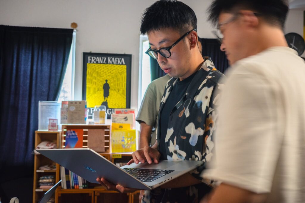
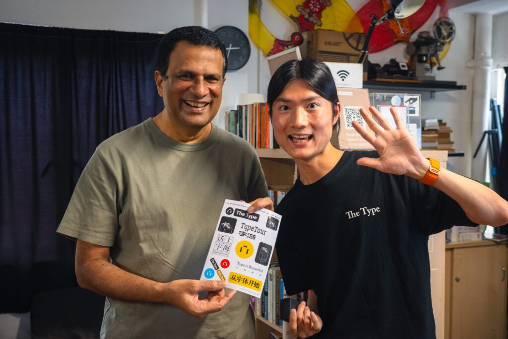
Some moments from yesterday’s workshop below! 📸