When designing Devanagari fonts, you have a choice in how to handle linear conjuncts—those forms where a half-form merges with a full form, like क्क (k_ka), क्द (k_da) or क्ढ (k_ddha). You can compose them dynamically using half-form components and OpenType features, or you can build precomposed conjuncts as distinct glyphs.
Dynamic composition is powerful and necessary for handling the long tail of possible conjuncts. You can calculate which iMatra variant to substitute based on the assembled width, and use the GPOS dist feature to adjust spacing between components programmatically.
But for frequently used conjuncts, precomposed forms offer real advantages:
Visual spacing control. The dist feature works mathematically, but you’re not seeing the result as you design. With precomposed conjuncts, you can visually adjust the spacing between components and see exactly what you’re getting.
Seamless rendering. When an application renders text with transparency or certain blending modes, overlapping components become visible—darker areas appear where paths intersect. A precomposed conjunct with merged outlines renders as a seamless form, avoiding these artifacts entirely.

iMatra matching. While you can calculate the right iMatra variant dynamically, precomposed conjuncts make it straightforward to substitute an iMatra whose top arc spans the exact width of the conjunct.
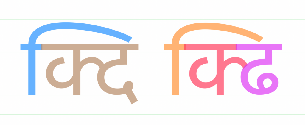
So while dynamic composition handles breadth, precomposed conjuncts give you precision and polish where it matters most. The challenge then becomes: how do you adjust spacing between components without losing the benefits of automatic alignment?
A Note on Workflow
This article describes a technique in Glyphs, though the principle may apply in other editors with similar features. In Glyphs, when you build a glyph from components, automatic alignment keeps those components linked to their source glyphs—any changes to the original propagate to all instances. This is what makes a component-based workflow manageable when you’re building hundreds of conjuncts. The challenge is adjusting spacing without turning this off.
The Problem
I make extensive use of components, which makes it practical to build hundreds of precomposed linear conjuncts while keeping the font maintainable. But not all components sit together naturally. Some pairs need to be nudged closer; others need a bit more breathing room. Sometimes I even create glyph variations (deep, deeper, high, higher, long) to handle different structural needs, yet even these require spacing adjustments depending on what sits beside them.
The conventional solution is to disable automatic alignment and position components manually. It works, but you lose all the benefits of automatic alignment—the propagation of changes, the consistency, the reduced maintenance burden.
One Approach: Half-Forms as Smart Components
One way to solve this is to make every half-form (k-deva, g-deva, and so on) a smart component with an adjustable width parameter. When placing a half-form next to different base forms, you’d simply adjust its width to get the spacing right.
This works, but it requires converting every half-form in your font into a smart component, each with its own width axis. That’s considerable setup work, and it adds complexity to glyphs that might otherwise remain simple.
A Simpler Solution: The Spacer Technique
Instead of modifying all half-forms, I created a single smart component called _spacer-deva.
The spacer contains just the shirorekha (headline), whose length adjusts with the width parameter. This keeps the headline continuous across the conjunct while allowing spacing control.
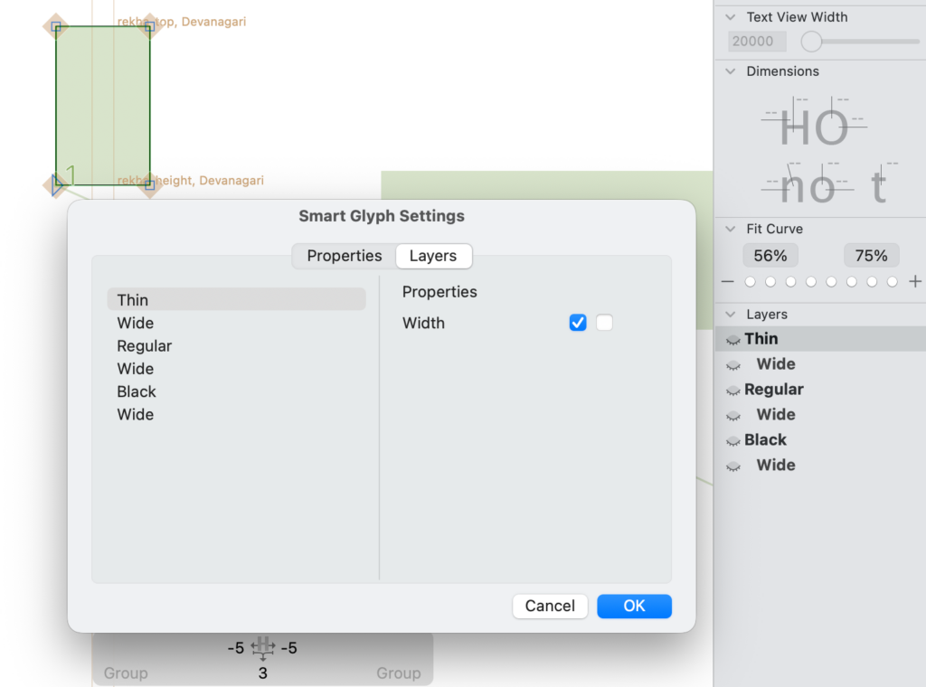
The setup:
- Minimum width: 2 or 3 units (essentially negligible)
- Maximum width: around 100 units
- The width itself is the adjustable parameter
When constructing a conjunct, I place this spacer between components. Using the slider in Glyphs, I can visually adjust the width—watching the components move closer together or further apart in real time. I stop when the relationship looks right.
One practical note: because the spacer starts so narrow, it can be nearly invisible and difficult to select with the mouse. The workaround is to select the first component, then hit the Tab key to cycle to the next component—which will be the hidden spacer. Once selected, the slider becomes available for adjustment.
The key advantage: automatic alignment stays on. When I update a component glyph, the changes flow through to all conjuncts that use it. The spacer simply holds the adjusted distance. And unlike the half-form approach, you set up just one smart component and reuse it everywhere.
One limitation to note: the spacer only adds space—it can’t pull components closer than their natural sidebearings allow. For the occasional conjunct that needs tighter spacing, disabling automatic alignment and adjusting manually remains the practical solution. This is a reasonable tradeoff: the spacer handles the common case, and the rare exceptions remain exceptions.
Multi-Part Conjuncts
This technique extends naturally to conjuncts with three or more parts. In a glyph like क्व्य (k_v_ya-deva), you can insert spacers wherever needed—between k-deva and v-deva, between v-deva and ya-deva, or both.
When working with multiple spacers, you have two selection options:
- Tab key: Select any component, then tab through to reach the spacer you want to adjust
- Cmd-A: Select all components at once. This reveals all sliders in the right panel simultaneously—one for each spacer—letting you adjust multiple spacing relationships in context.
Handling Headless Half-Forms
The spacer technique relies on the shirorekha—but not all Devanagari glyphs have a headline. Three half-forms are headless: th-deva, dh-deva, and sh-deva. For conjuncts like th_ya-deva, the standard spacer won’t work.
One option is to create a headless spacer—a smart component with just empty space. This works functionally; the space is exported and spacing behaves correctly. But Glyphs displays a rounded rectangle indicator for glyphs without outlines, which shows up in your editing view and Font View. It looks like something is broken, and if you’re working with clients, those boxes need explanation. It works, but it feels hacky.
A cleaner solution: since there are only three headless half-forms, convert just these into smart components. Create _smart.th-deva, _smart.dh-deva, and _smart.sh-deva with the right sidebearing as the adjustable parameter. The default layer has your standard RSB (something like -70, depending on your design), and the spaced layer has it set to 0.
In conjuncts like th_ya-deva, th_na-deva, or dh_va-deva, use the smart half-form instead of the regular one. You get the same slider-based spacing control while keeping automatic alignment intact—without the visual clutter of empty-glyph indicators.
Closing Thoughts
It’s a small trick, but it lets you have both: the precision of manual adjustment and the maintainability of automatic alignment. While this technique relies on the shirorekha and is specific to Devanagari, the underlying principle—using a smart spacer to preserve automatic alignment—may inspire similar solutions in other contexts.
Acknowledgements
Norbert Lindenberg reviewed the first draft and provided useful feedback. Rainer Erich Scheichelbauer‘s positive response encouraged me to share this more widely.